Personal project · Research-led design
mitti: designing a food app around real complaints, not assumptions
A small survey (14 responses) surfaced three specific frustrations with existing food apps. This is the screen that answers them.
Context
Most food-delivery apps look similar: the same card layout, the same "Add" button, the same photo-first hierarchy. Instead of redesigning an existing app, I wanted to find out what actually frustrates people, then design specifically against that. I ran a short survey of 14 responses, mixed Tamil and English, asking people how they order food and what goes wrong.
Research
- 9 of 14 respondents said they would rather go to the restaurant directly or take away than order through an app.
- Price is the first thing people check (8 of 12), reviews second (6), photos last (2).
- The most repeated frustration was hidden or extra charges that only show up late in the order flow: delivery fees and "add more to get a discount" nudges (4 mentions).
- Second: can't find the dish they actually want. Poor sorting, items "hidden somewhere" in the menu (3 mentions).
- Nobody had a confident answer for finding traditional, home-style meals. One respondent wrote, "No app is good for regular traditional meals." Those who named Zomato or Swiggy did so for variety, not authenticity.
Insights
Users struggle to trust the final price, because extra charges only appear late in the order flow.
Users struggle to find the dish they actually want, because menu sorting doesn't match how they think about food.
Users struggle to find authentic, home-style meals, because existing apps are optimised for variety and speed, not authenticity.
Limitations. Small, self-collected sample (14 responses), skewed toward male respondents (13 of 14 identifiable), and one question was duplicated on the form. The findings are directional, not statistically significant, but consistent enough to design against.
The design response
Three insights, three specific changes. Not a full app redesign, just the parts that were actually broken.
- All-in pricing. Every price shown is final. A small "No hidden charges" badge makes the promise visible, not just true.
- Filter-first discovery instead of a plain scroll list: Veg/Non-veg, Traditional/Home-style, Price, Serves how many.
- "Home-style" and "Banana leaf meal" tags on relevant dishes, so traditional food is findable, not buried in a generic list.
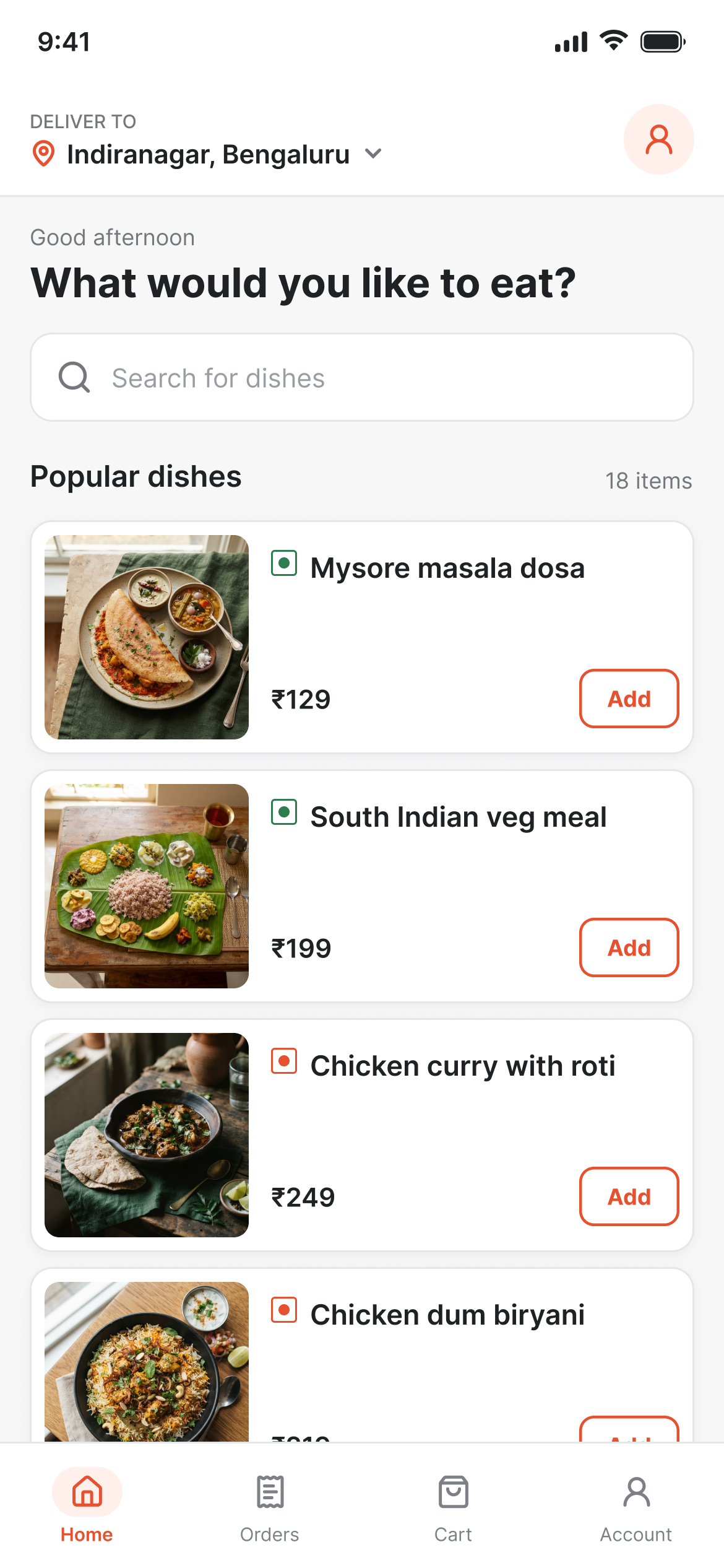
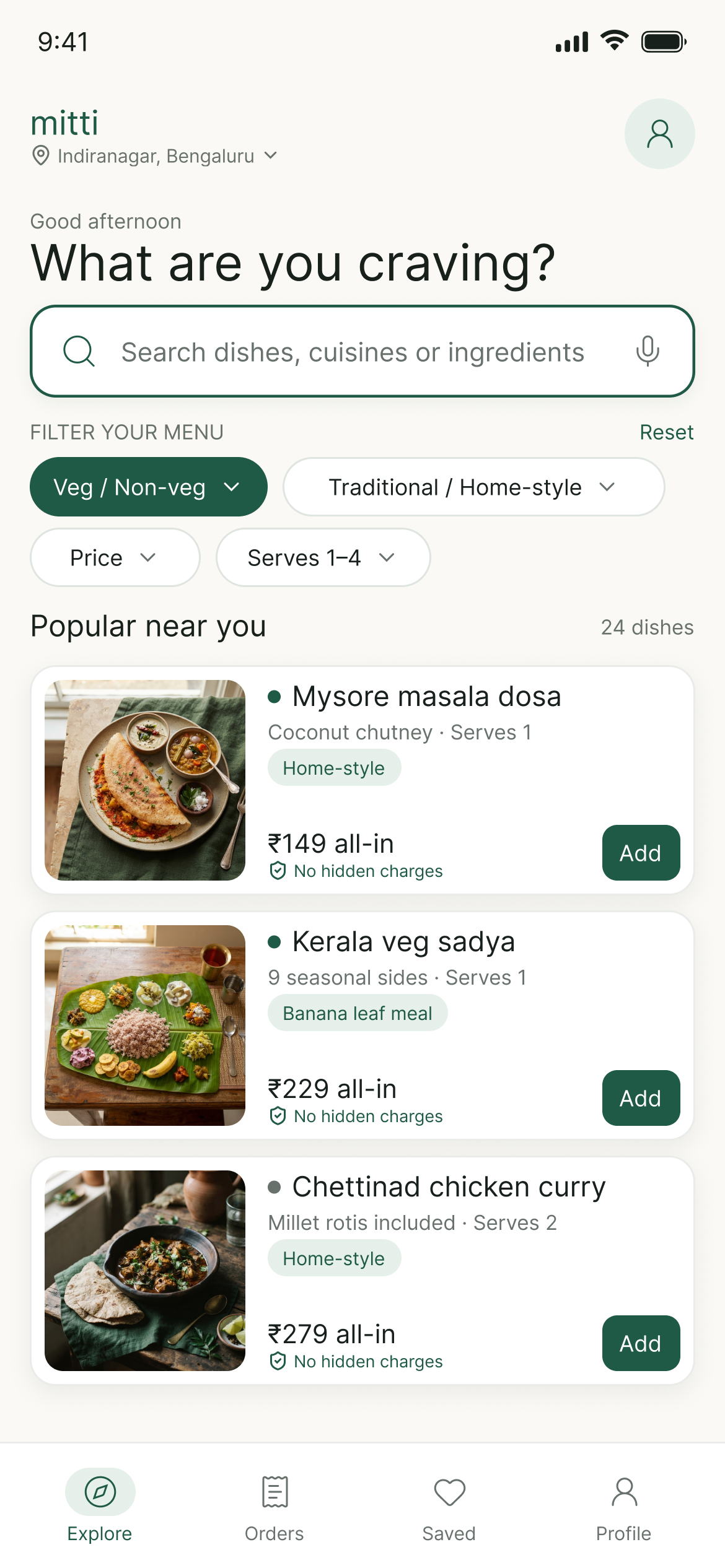
- All-in pricing with the "No hidden charges" badge
- Filter-first search
- "Home-style" and "Banana leaf meal" tags
Outcome
The comparison makes the design decisions legible on their own, with no paragraph of explanation needed to see what changed and why. The bigger takeaway: three respondents' complaints, taken seriously, produced more useful design direction than a generic "redesign this app" brief would have.
What I'd do next
Test the filter-first layout with a few of the original 14 respondents, and expand the survey sample before treating any finding as more than directional.